Stadium Digital
Stadium Digital launched in 2014 with a mission to bring world-class fan engagement platforms to top sports properties. In collaboration with its clients, and many large sports properties, Stadium Digital has created and managed media solutions and technology products in the areas of sponsorship, fan engagement, ticketing and e-commerce.
The goal was to come up with a visual identity from scratch and expand it over various mediums, including a logo, business cards, a WordPress site and web graphics. A style guide was also designed to show any third-party users how to visually represent the Stadium Digital brand in a proper manner.
Role: Graphic Designer
Client: Stadium Digital
Agency: Brand & Mortar
Web Development: Brandon Copeland
The logo anatomy was inspired by the structure of a stadium or coliseum. I wanted to design a bit more of an abstract interpretation when it came to the stadium visual by tying it in with the wavy lines that represent motion lines, something that could align nicely with the free-flowing movement of sports. With the bold, uppercase, sans-serif typeface, the Stadium Digital logo gives off a strong and confident presence. The logo’s colour psychology of using a medium Blue and medium Grey colour instills a sense of reliability and loyalty. Both represent crucial aspects when it comes to fan engagement, sponsorship deals and making high-profile sports properties a top priority.
Part of the process of building a logo and a broader visual identity is concept exploration. This is where you can start to see parts of the logo starting to come together.
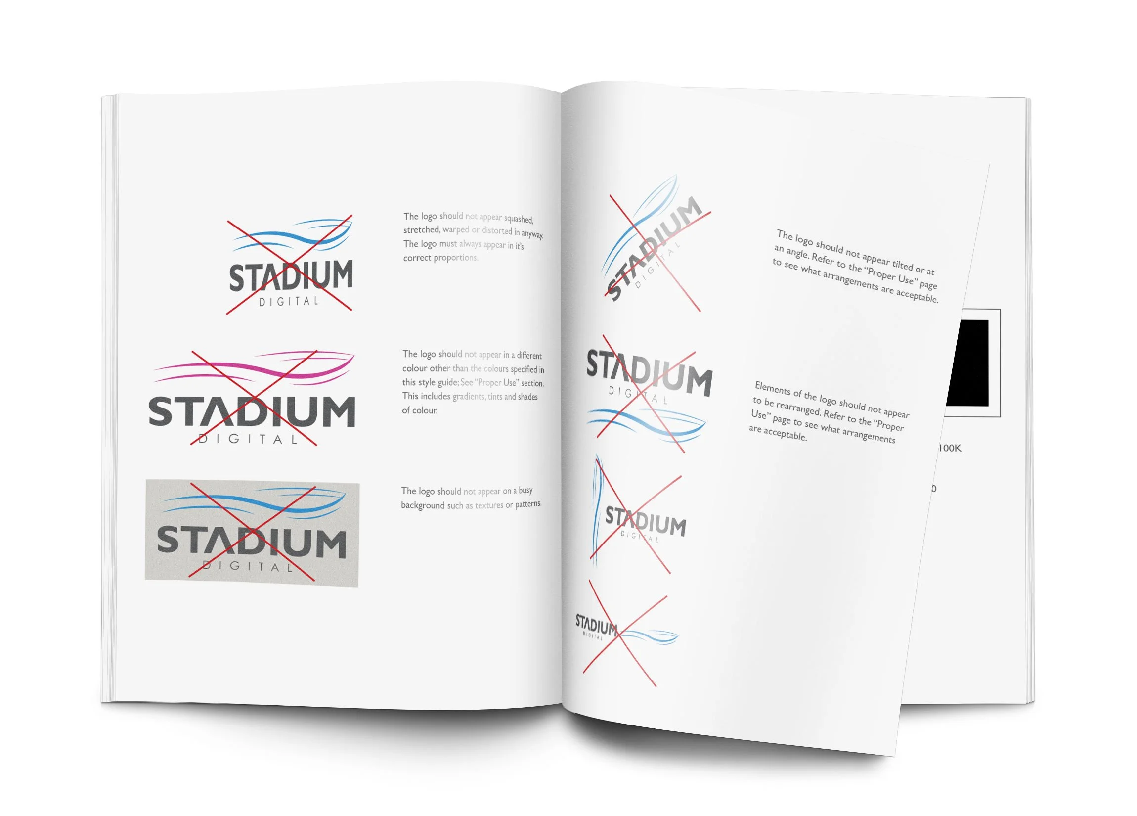
With the launch of Stadium Digital, it was necessary to release the Stadium Digital Brand and Style Guide. This is to ensure that their brand is used appropriately and represents their business in a positive manner. This guide was created so that anyone working with the business knows how to work with their brand in an appropriate manner, whether it’s designers, developers, engineers, printers or accountants.


Double-sided business cards were designed and mocked up.

Stationery mockups leveraging the main brand colour, Medium Blue.
